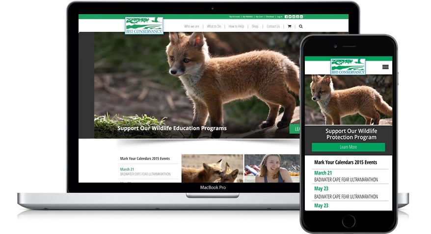
Responsive Web Design

A very common term in the field of web development is responsive web design. But what exactly does this mean?
Responsive web design, which is a concept created by Ethan Marcotte, means that a website responds automatically to the environment in which it displays. This usually refers to a website originally designed for viewing on a desktop computer adapting itself to work on a mobile device, where there is far less space than on a standard desktop monitor. But the site also needs to respond to very large screen sizes as well. It further must adapt to screen orientation on mobile devices as well.
Web developers can make their sites responsive through two different mechanisms: fluid grids and media queries.
Fluid Grids
In the past, web pages typically had fixed pixel layouts. This means that elements on the page, such as text containers and images had a set width and length. This worked well when everyone was viewing the web using monitors that were relatively similar in terms of size and aspect, but it does not work so well when users are viewing the same page with dramatically different types of screens, such as on both a desktop monitor and a mobile phone.
With fluid grids, elements of page, whether they be text or images, display in proportion to one another. This way a page can display properly regardless of the screen's size or orientation. Web developers design fluid grids by computing how much space each page element takes up in proportion to available space. Once this has been computed, instead of describing the page elements in the source files in terms of pixels, web developers describe them in terms of percentage of space available.
Media Queries
While fluid grids are a terrific way for adapting a web page to multiple screens and orientations, they are not perfect in all situations. This is because some sites have been designed specially with a wide screen in mind. For example, a design that utilizes multiple columns would not display well on a mobile phone in portrait mode, regardless of proportion.
Fortunately, web developers can design multiple page layouts with a single set of source code through something called media queries. Media queries are a component of cascading style sheets (CSS). These files define the layout of the web page, and through media queries web developers can determine the width and the height of the user's screen and display a completely different layout based on these sizes.
Using media queries, a single site with a single code source can display one layout to desktop computer users and a different one to mobile phone users. These layouts can be so different that users might believe that they are using completely different sites. Likewise, developers can create different layouts for tablets and for very large screens.
By utilizing fluid grids and media queries, web developers can save time and money by creating and maintaining a single source for their website. Having a single source also makes it easier for search engines such as Google to find the site and properly rank it.
Need help making your website responsive? Contact us for options!

