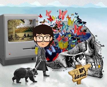
72dpi Land

Fireworks vs Photoshop
When I was first introduced to web design with Adobe Fireworks, it felt like I was entering a whole different realm. I'd never used it before and already had a long-standing relationship with it's fellow Adobe programs Photoshop and Illustrator. Image resolution was king, the standard of 300dpi (dots-per-inch). Everything was created for print and needed to be anything but blurry. Even in my photography experience, the grain on the film is so fine, it's practically impossible to count the dpi. High-resolution ruled my life as a designer.
But designing for web, in Fireworks…this was a new concept for me. The dpi standard for web design was lower…72dpi, are you serious? You mean I can create designs at such a low resolution that cutouts don't have to be perfect? Photo-correcting looked better, stamp-tools were easier, images that would print 3"x3" were huge on screen…and to think, that was only the beginning.
But with every good thing comes a price and that price was color. In 72dpi Land, you have to use RGB colors. You suddenly are limited from every color, lack of color and unimaginable hue of the rainbow to 216 "colors." A client wants a website to be a bright blue, but is picky so you want to show them all of their options but there seem to be only three! As a designer, this is a pretty hard concept to chew. I thought it might drive me crazy, but I somehow forced myself to adapt. Honestly, the price of amazing on-screen resolution for less colors? At least I have color options, right? Right. Right?
While I do love living in this land that requires so few dots-per-inch, I'm pleased to know it's never a permanent stay.

