Web Design Trends That Are So Last Decade
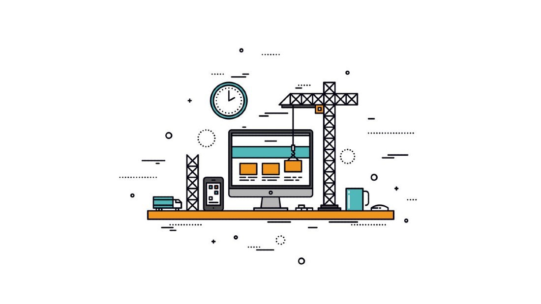
Since we already talked about some of the biggest changes in marketing strategy over the last decade, we thought we’d do the same for web design.
See, the point of marketing is to get as many people to convert as possible. But to become customers, people need to learn more about a company and its products and/or services, and for that (at least in this day and age) they typically visit the business’ website.
Of course, your marketing efforts won’t do much good if the website you’re pointing customers to is outdated and/or dysfunctional.
The days of dealing with bad web design are gone. There’s no longer any need for customers to use a crappy website because they can almost certainly find someone else who’s doing it better. And that’s why good web design is so important. Failure to keep up with the latest trends will result in people leaving your site faster than a barefoot jackrabbit on a hot greasy griddle in the middle of August.
So with that in mind, which web design trends from the 2010s might be better left behind? Well, before we start, we just want to say that none of these are hard and fast nos. That is to say, there is a time and a place for everything, even older design trends.
Unreadable Fonts
Back when the internet was still in its infancy, there were very few fonts to choose from. We had Helvetica and maybe a handful of others, and that was enough. Now though, we have hundreds, if not thousands, of fonts at our disposal. And, while having options is generally a good thing, there are always going to be websites that go a little… overboard in the font department.
In the 2020’s, we think it’s time to leave behind those annoying super-thin fonts and anything that features a hard-to-read hand-lettered look. That said, you also don’t want to choose a generic font that’s too boring to keep people reading your content. This decade, consider using a font that’s thick enough to stand out when viewed on a backlit screen and provides contrast when compared to other website elements.
Endless Scrolling Pages
We’ve all encountered one of these pages before; the kind where you keep scrolling further and further down, and new content just keeps appearing. Now, you see this practice on social media a lot because the point of those sites is to keep the user there longer. That’s not to say you don’t want to keep users on your site longer - you certainly do - but social media sites don’t really have to worry about SEO, whereas you do.
Instead of forcing your customers to get hand cramps from the dreaded infinite scroll, make a new page! People know how to use menus at this point. They can make their way around your website navigation just fine. Plus, there’s no SEO benefit to having super long pages. In fact, having multiple pages filled with fresh, relevant content will help you rank much better than one giant page ever could.
Huge Hero Images and Videos
Even though it's 2020, and technology and design are better than ever, that doesn’t mean everyone has excellent internet access. Your website should be usable by anyone, anywhere. Since there are plenty of countries around Africa, South America, and Asia with very slow internet, you might want to consider a design that caters to everyone, instead of the percentage of users with good internet.
Huge header videos and hero images that appear at the top of your homepage (or any page for that matter) need to go. For one, they take up valuable space that could be filled with useful content. The other issue with them is that they take forever to load. And since nobody likes page loading animations, huge videos/images aren’t always the best move.
Homepage Sliders
Since we’re on the topic of the homepage aesthetic, let’s talk about sliders. This is a trend that’s actually been around for a good while now, but we’re at the point where we can confidently say that they aren’t always the right choice. One of the reasons for this is that they often scroll too quickly for a user to actually digest the content and decide to click on it. Another is that sliders are rarely done well, in that the CTAs used are generally not that attractive to users.
But the main reason is that most people have trained themselves to ignore homepage sliders entirely, so even the most well-designed graphics with the most eye-catching content may not get any bites. Think about it - when was the last time you clicked on a slider?
Cluttered Sidebars
To give them credit, sidebars have good intentions. Their goal is usually to help website traffic navigate to pages relevant to the one they’re on; sort of like if your GPS took you where it wanted to go instead of where you needed to go. They're also used to call attention to things deemed “important” by the web designer, like contact information… or the weather.
The problem is that they tend to muck things up. You can take the cleanest, simplest design ever, slap a couple of sidebars on it, and it’ll turn into a crowded mess. Again, people know how to find what they want, so shoving it in their face in the form of a sidebar just really isn’t necessary anymore. That said, they can still make a valuable addition to a blog where they're used to make finding older blogs easy.

Honorable Mentions
There are just a few more design trends that need to go that, in our opinion, don’t need much explanation:
- Generic stock photos. Take your own photos, or at least find some stock images that aren’t used on every other site.
- “Coming Soon” anything. Why, just… why exactly are these a thing? It doesn’t matter if it’s announcing a new site, a new service, or a new page, why not just wait until whatever you’re releasing is ready?
- Onsite social media. We aren’t talking about social buttons, but rather onsite feeds. The reasoning here is that these are just like sidebars: messy and superfluous.
So there you have it - web design features that need to be told to take a hike. If you’re reading this while looking at your website and you’re thinking, “Oh dear... My site ticks a lot of these boxes,” guess what? It’s time for a redesign! Get in touch with us so we can show you just how beautiful a website can be.